Alliance for Child Protection in Humanitarian Action UX/UI Design Internship
I have the incredible opportunity to assist with the revamp process for an organization affiliated with the United Nations that works to raise awareness and put an end to child violence, exploitation, and abuse. As I was wrapping up the final months of my Boot Camp journey, I began interning at the Alliance as a Child Protection Minimum Standards Working Group Intern. However, when I learned that the organization was undergoing a complete re-design of the website, I packaged up a slide deck and presented how my UX/UI skillsets would make me an asset to the team. As the Alliance’s first UX/UI intern, I am responsible for conducting research, creating low to high fidelity mockups, handing off assets to the developer, and iterating and ideating to make sure the new website is designed based on Alliance users needs.
Project Overview:
Supporting the consultation of re-design of the Alliance website;
Developing mock-ups and wireframes for the new Alliance website;
Support communication between the Web Development Team and the Alliance Team;
Participate and take notes during bi-weekly check-ins with Web Development Team.
TOOLS: Figma, Axure RP, Survey Monkey, Zoom, Miro, Invision, Google Docs, Slides, Sheets
The Challenge
Re-design the non-profit organization’s website by pinpointing user pain points to improve engagement and accessibility.
Implement the double diamond design process and UX theories and present to stakeholders on findings. Create mockups and prototypes to hand off assets to the development team.
The Problem
The Alliance website is used by thousands of child protection actors and organizations around the globe to set minimum standards to set standards and improve the lives of children in impoverished nations.
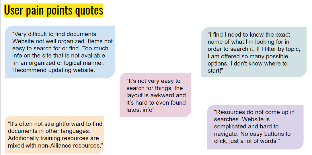
Users find the website confusing and the search bar dysfunctional to find information and resources.
Members who speak languages other than English find it difficult to access and understand technical materials.
Members in developing countries find the website slow as there are many outdated technical resources and materials.
The Solution
Our goal was to re-design this non-profit organization's website by
Improve the overwhelming information architecture and navigation bar to make the website more concise and easier to navigate.
Utilize google analytics reports to indicate what areas of the website need improvement.
Create a responsive website to ensure that our information is accessible on all devices.
Differentiate Alliance products/resources from other member organizations.
Improve taxonomy and folksonomy to better list content and use more familiar words for users to comprehend.
Research Phase
We began the re-design process by surveying 54 Alliance members and interviewing 8 participants to learn more about their user frustrations, needs, and wants on the Alliance website.
Findings of Users Needs
Survey and Google Analytics Results
These survey results and Google Analytics reports helped to define the primary issues members face when using the existing Alliance website. From these findings, we narrowed down the needs of Child Protection Humanitarian Practitioners:
Majority look for CPHA guidance and technical materials
Many look for CPHA tools and resources, trainings and e-learnings
Users are interested in finding CPHA events and webinars
Interested in job vacancies
Users also look for networking opportunities and partnerships
Interviewing Process
Alliance members were also interviewed in which we asked them to share their screen and navigate through the Alliance website to pinpoint their struggles and frustrations when finding information and resources. This is when I learned that Arabic native speakers find it challenging to navigate the website as it was not effectively designed for languages written from right to left. Based on these interviews, we learned that the Alliance needed to better design for internationalization.
Search Bar Function
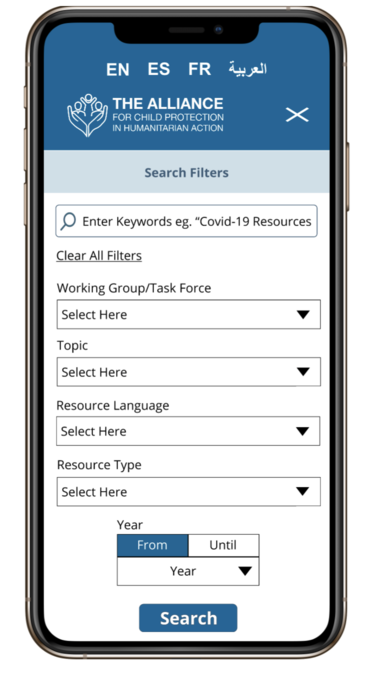
The existing Search function did not give users the ability to narrow down and search for specific resources. This led to confusing as they were unable to find the documents, materials, and pages they were looking for. For this reason, I created a detailed search or filter by content option to alleviate this
Updated Search/Filter Option Tested with Members
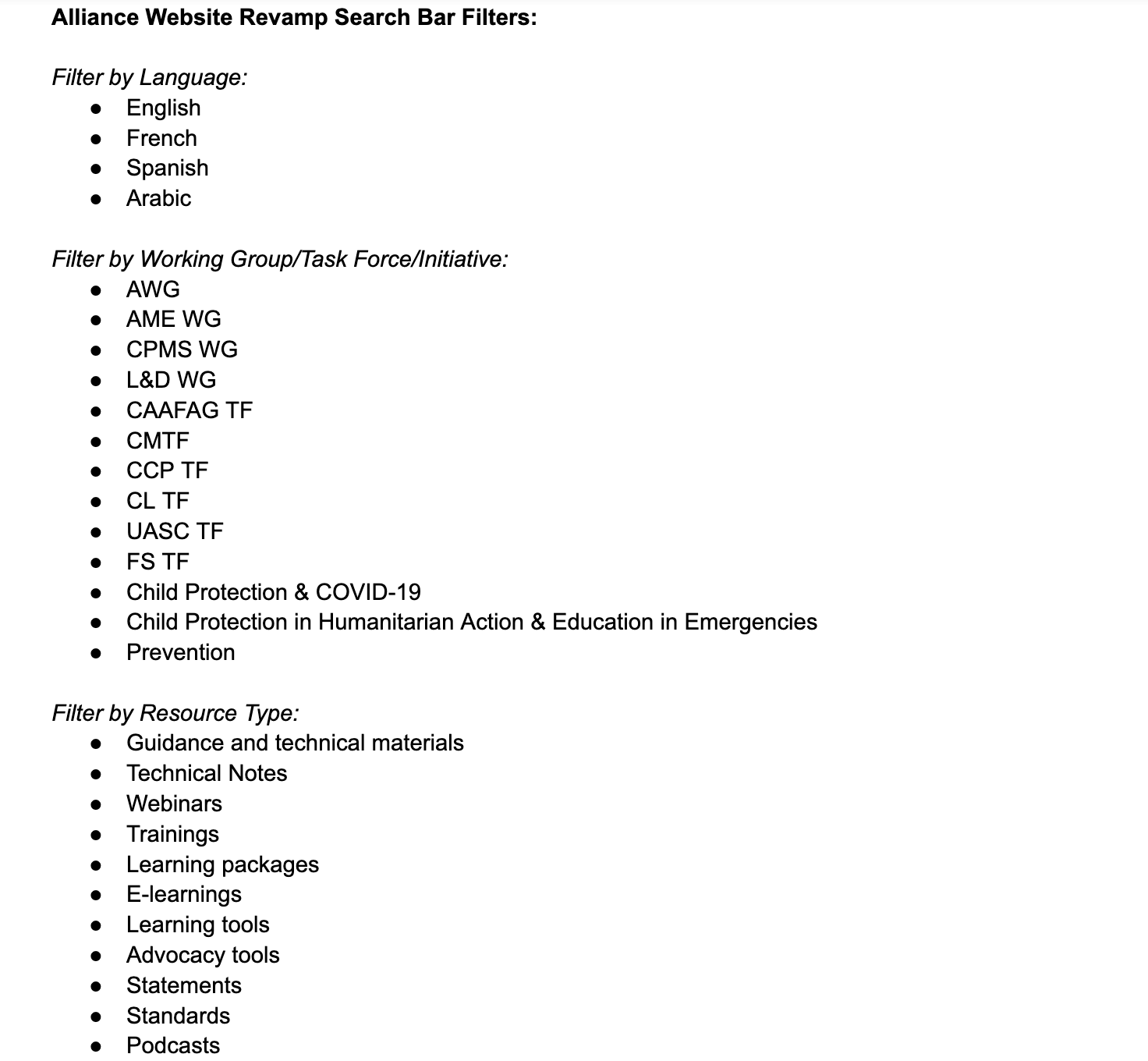
Pooling Filter Categories from Alliance Employees
I used the survey/interview feedback to comprise the main filter options that users were interested in finding. After selecting the categories, we reached out to focal point Alliance leads to comprise a list of filter options users can select to narrow down and find the information they are looking for.
Mobile Version of updated Search Function
Designing for Internationalization
Existing Alliance page in Arabic
Here you can see a side by side comparison of an existing Alliance page in Arabic (left side) and a mockup I created to provide the developer clearer instructions on designing pages for Arabic natives (right side). This was a challenge as it was my first time dealing with a website that allows users to view the website in four languages: English, Arabic, Spanish, and French. Using my knowledge in the Arabic language from taking courses in college and in my study abroad, I created a mockup using Lorem Ipsum Arabic text to design the layout of the page from right to left to make it easier for Arabic speaking Alliance members to use the website.
New Alliance Arabic Mockup
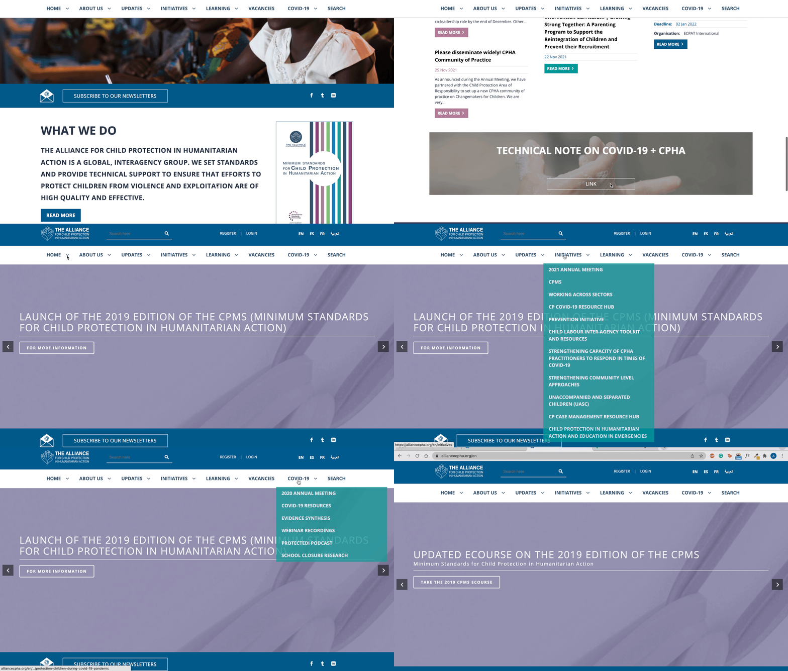
Current Alliance Homepage
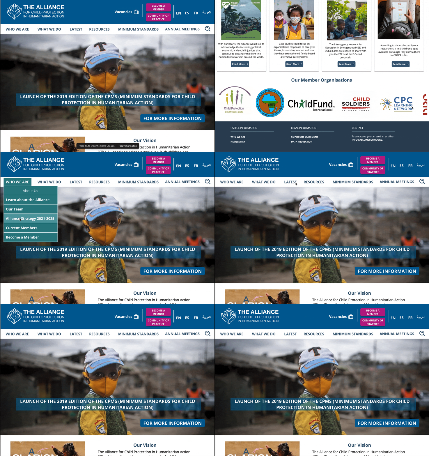
Our users expressed that the current homepage lacked engagement and it was confusing to find resources from Working Groups, Task Forces, and Annual Meetings. For this reason, we made it our goal in the revamp to improve the aesthetics and pull primary resources out in the navigation bar to provide a more user-friendly experience for our users.
Wireframe Mockup
My next step was to create and present a wireframe mockup to stakeholders and the Knowledge Management team of the Alliance homepage to showcase how we can improve our layout and navigation bar to alleviate user struggles and increase engagement on our website
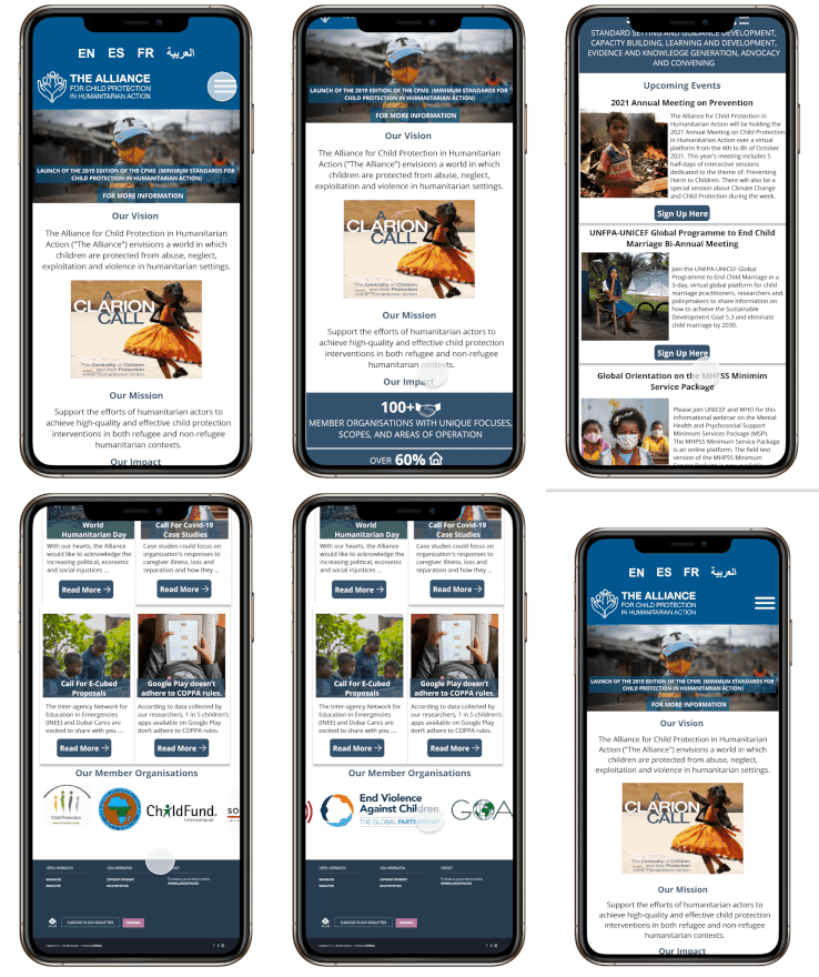
Updated Alliance Homepage based on User Insights
Alliance Homepage Mobile Version for RWD
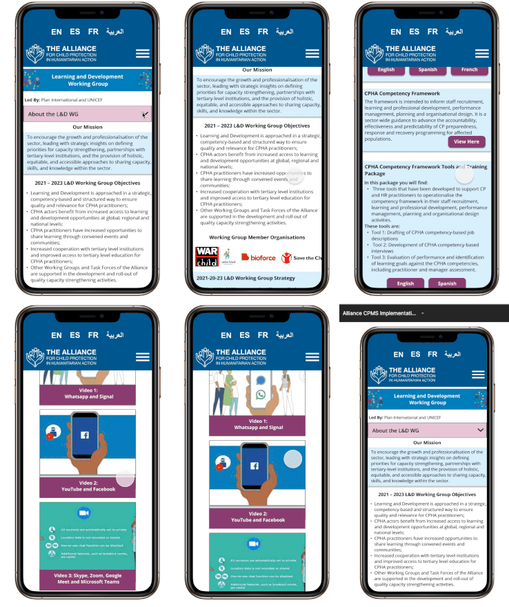
Example of a Redesigned Working Group Page
“About Us” Page Comparison
Existing Alliance “About Us” page was too text heavy and lacked aesthetics
Revamped “About Us” page with clear goals and direct links to Working Group and Task Forces in addition to placed them in the drop down tab of “What We Do”
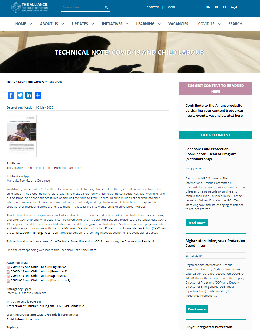
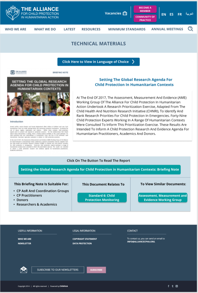
Existing Technical Material Page
Our users expressed that these pages were confusing as they are text heavy and find the multiple links confusing. The new mockup includes buttons along with a description for members to understand each resource before clicking on it.
New Technical Material Mockup
Final Thoughts
This opportunity has been such an incredible experience. I am so thankful to the Alliance for allowing me to work on this project as it has made me more passionate than ever to pursue a master’s degree in HCI to hone in on my skillsets and think of design questions I never thought of before. Since September, I have been working with the Knowledge Management team, putting my UX/UI learnings to the test to revamp this organization’s website and ensure it is accessible for Child Protection Actors around the globe. This project has shown me how much of an impact designing and listening to users can have on an organization.
Special thank you to my supervisor, Kyra, for allowing me to document my design thinking and process on my portfolio!
Next Steps
Continue obtaining feedback from Alliance members and conduct Guerilla tests to ensure users are able to use the revamped version of the website
Continue working with the development team, working out constraints, and packaging assets to ensure a seamless implementation process
Ensure the website is ready for launch day in March
Use my learnings from the HCI Master’s degree I aspire to obtain to make additional changes after learning new skill sets and the theoretical/methodological approaches of HCI!
Tools
Design Process


