Project Overview
Destinator is an app for travelers to use post-pandemic to make choosing and planning a vacation a breeze. I added this project to my portfolio to show my growth in design and human-centered thinking as there are always ways to improve in the field of UX/UI.
MY ROLE: UX/UI designer (Individual Project)
TOOLS: Figma, Miro, Invision, Google Docs, Slides, Sheets, Forms
TIMELINE: 4 weeks
The Challenge
For my first UX design boot camp challenge, our cohort was tasked with designing an app for travelers to use post-pandemic. With my little exposure to UX/UI, this project put my design thinking to the test by incorporating the double diamond design process to conceptualization, design, test, and present an app.
The Problem
One of the hardest parts of planning a trip is picking a destination and finding activities you would enjoy doing. With so many destinations to choose from, how do users narrow down their search?
The Solution
Make travelers lives easier by assisting them with finding the perfect destination along with fun activities to do that pertain to their interests
Definition and Ideation Phase
To learn more about what pain points travelers face when planning a trip, a google survey was conducted to receive quantitative data as well as six user interviews to better understand their struggles.
User Quotes
"Traveling can get repetitive such as sightseeing and visiting landmark, I'd like to do something different and have more variety"
"The hardest part of traveling is finding the best place to go to that will have things to entertain you. that’s what the majority of the planning goes into"
"Someone’s review will have a great factor on my decisions. if I have no idea what to expect, I am shooting blind hoping to aim at a target."
"I usually have my friends do the researching as I do not have the time or patience"
"I do not like researching at all, i want more apps that can find that for me"
Affinity Diagram
Using the findings from the user interviews and surveys, the next step was to create an affinity diagram to find commonalities among participants regarding what aspects in a travel app users needed most.
User Persona
I then created a User Persona based on the user interviews and research to pinpoint the needs and frustrations of users.
Meet Sandra Bolton, she has a passion for traveling but is indecisive when planning a trip, hates spending time researching, and wants to visit areas the average tourist would not think of visiting.
Feature Prioritization Matrix
Using the MoSCoW Method, I then worked on prioritizing which features would be “must-haves” based on user insights and research
Storyboard
The next step was to make a storyboard to explain a typical user’s journey and struggles of planning a vacation and how the Destinator travel app resolves those pain points.
Competitive Analysis
I conducted an analysis for direct and indirect competitors to see what other travel apps were doing well and how I could make this app better. With this analysis, I was able to review opportunities and considerations needed to develop Destinator. Looking back, I would have added destinator into the mix to showcase how this app differs from its competitors. I would have also added indirect competitors in addition to the direct competitors shown.
User Flow
To visualize potential user journeys, I created a user flow chart. This was an important step to think through the potential features within the app. Looking back, I would have created a better layout to make the process of reading and understanding this user flow easier.
Sketching and Iterations
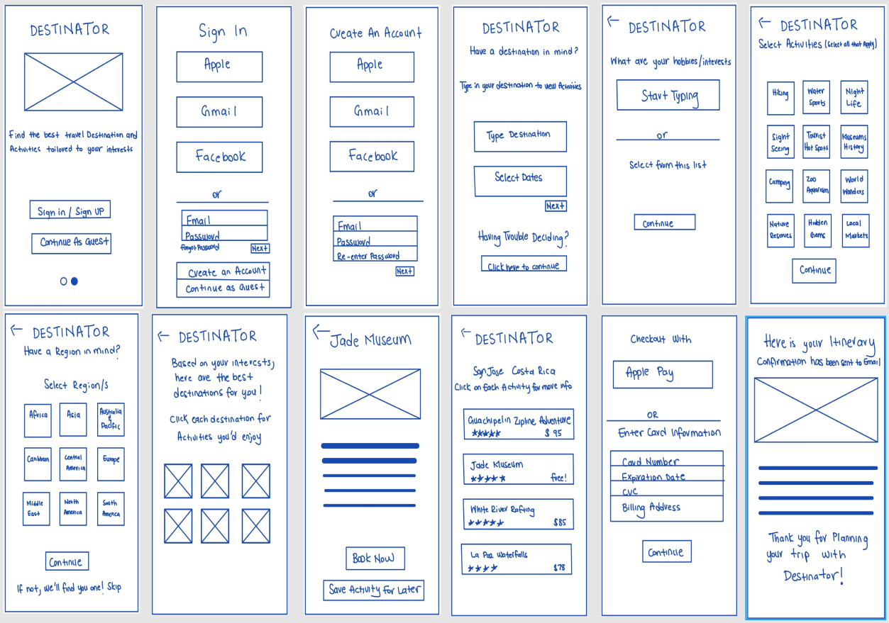
Before creating the low-fi prototype, I sketched out the screens to think through the process of how users would interact with the app. I then tested them with users to ensure that travelers were easily able to navigate through the screens
Prototypes
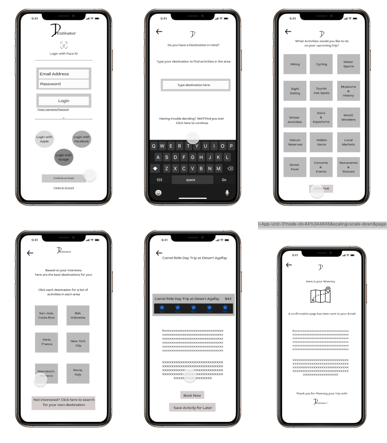
The next step was to create Mid-Fi prototypes which were then tested again with users. During the testing phase, users mentioned that they wanted to be able to put in their preferences if they did not have a destination in mind. Users also wanted to be able to read a description of each activity and other reviews before deciding to book an activity.
Mid-Hi Fidelity Mockups
Mid-Fidelity Prototype
Knowing what I did at the time, this was a very detailed Mid-FI mockup showcasing the steps users would take to find a destination and book activities. At the time, I did not know lorem ipsum text existed, which is why I used a number of x’s as a placeholder. Looking back, I would have done more user testing in this phase to see what could be changed to alleviate struggles before creating the high-fidelity version.
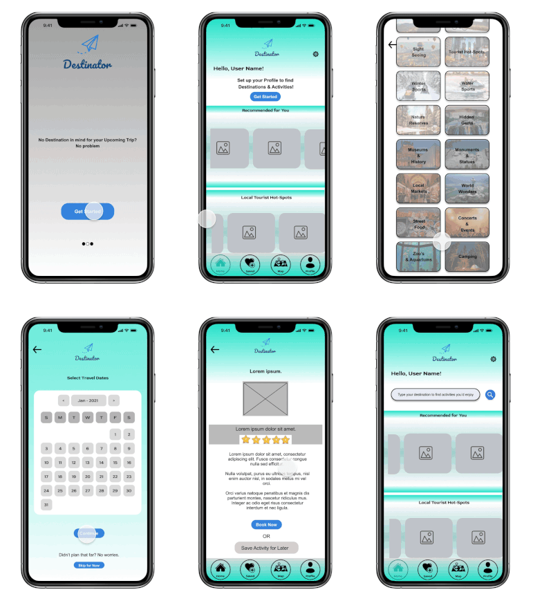
Hi-Fidelity Prototype
Looking back on these mockups, I question if the colors are AAA compliant and if the text is readable behind the images in the questionnaire process. I also would use clearer icons for the menu in the home page and fix color/language inconsistencies throughout the app.
Final Thoughts
This was my first UX/UI challenge in my boot camp using my new learnings to research, conceptualize, and ideate an app.
Looking back, some of the changes I would make are to test the color scheme for accessibility, make the app more consistent, use better icons for the menu bar at the bottom, and do more user tests to determine users needs, wants, and struggles with the navigation and use of the app.
Next Steps
Conduct more tests and gather more participants to use the app and provide feedback on their thoughts and struggles while using the app
Implement a “find the perfect place to stay” feature as well
Work on iterating the app and ask more questions to narrow down selections to find the best destinations and activities for users
Tools
Design Process


