

Morristown Habitat for Humanity UX Research & Desktop/Mobile UI Redesign
Morris Habitat for Humanity builds houses and rehabilitates families in need, with the support of a network of volunteers.
Project Overview: Teams of four Columbia Boot Camp students were tasked with choosing a nonprofit organization to undergo a User Experience (UX)/ User Interface (UI) design process. We used the double diamond design thinking model to undergo a meaningful redesign for Morristown Habitat For Humanity by getting in touch with stakeholders, surveying, and conducting interviews to find user frustrations to make improvements.
MY ROLE: UX Research (Group Project with 3 Columbia Cohort Members)
TOOLS: Figma, Miro, Invision, Google Docs, Slides, Sheets, Forms
TIMELINE: 2 week sprint challenge
The Challenge
Work with a team of 4 to redesign a meaningful non-profit organization’s website by reaching out to stakeholders and interviewing members.
I was mainly in charge of UX Research but pitched in the UI redesign as it was all hands on deck.
The Problem
Morris Habitat for Humanity has a great purpose and mission but does not display it clearly on the homepage.
The primary navigation bar is overwhelming and has tabs that can be consolidated.
Users find signing up to volunteer confusing.
The website lacks information architecture.
The Solution
Our goal was to improve this non-profit organization's website by:
Improving accessibility and user-friendliness to increase interactiveness and engagement.
Clearly display the organization’s mission and vision.
Make it easier for members to contribute to the greater good by signing up to volunteer or donate.
Definition and Ideation Phase
To learn more about what pain points Morristown Habitat for Humanity members face when using the website, we interviewed existing members, new members, and stakeholders to better understand their frustrations and struggles when using the existing site.
User and Stakeholder Interview Insights
"Volunteering helps build bonds, skills and confidence"
“I wish signing up to volunteer was a quick and easy process”
“We would love to make changes to our homepage to draw more people in”
“People do not know that our Restore funds the Morristown Habitat for Humanity”
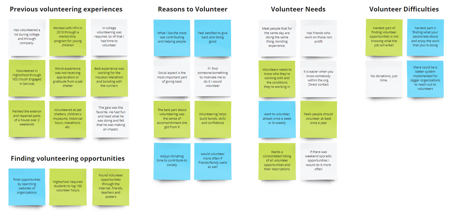
Affinity Diagram
Using the findings from the 6 user interviews and a google survey with 18 responses, I created a clustered affinity diagram to find commonalities among users regarding their needs, wants, and struggles on the Morristown Habitat for Humanity website
What I would do differently
Due to the short timeline, it was difficult to find the root cause of problems members face when using the existing site. Many people who filled out the volunteer survey had not previously volunteered with Morristown Habitat for Humanity. The stakeholders responded to us one week into the project which get us insightful information about user pain points they experienced but did not leave us with enough time to carry out the changes and re-test. If I were to re-do this project, I would spend more time in the research phase to dig deeper into user frustrations. I would also like to learn the best methodologies and methods to carry out meaningful research for the target audience. I also would benefit from learning how to foster and meet the needs of both stakeholders and users as I found that they often have conflicting views.
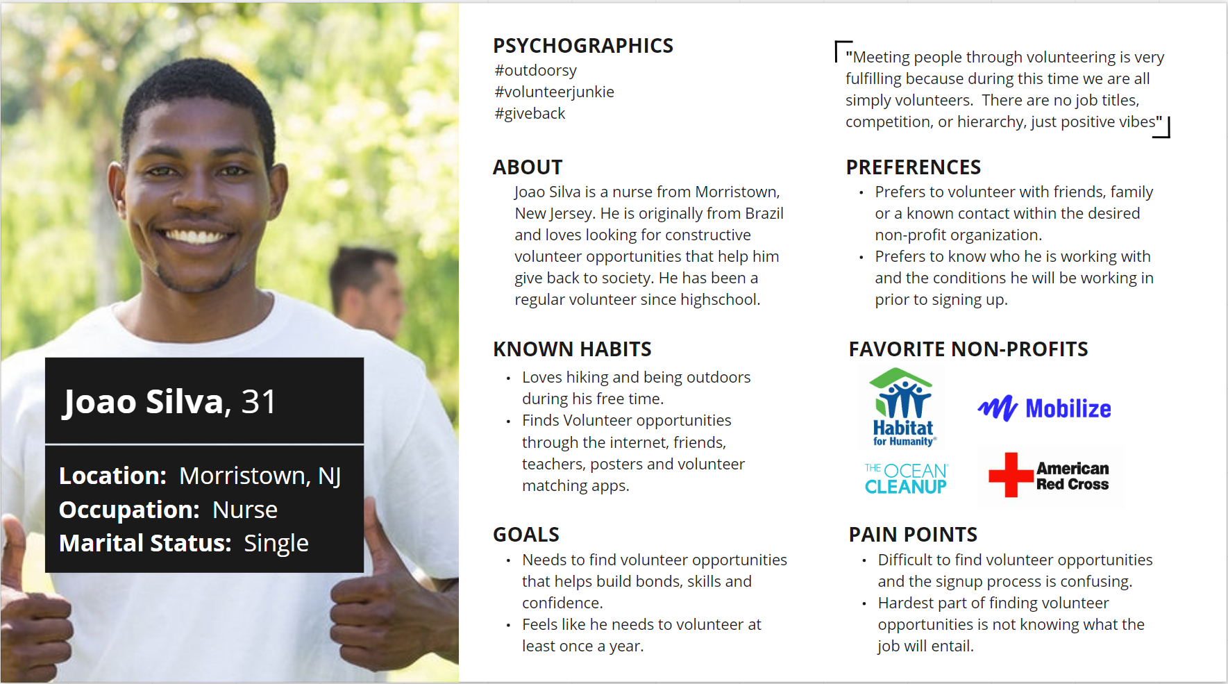
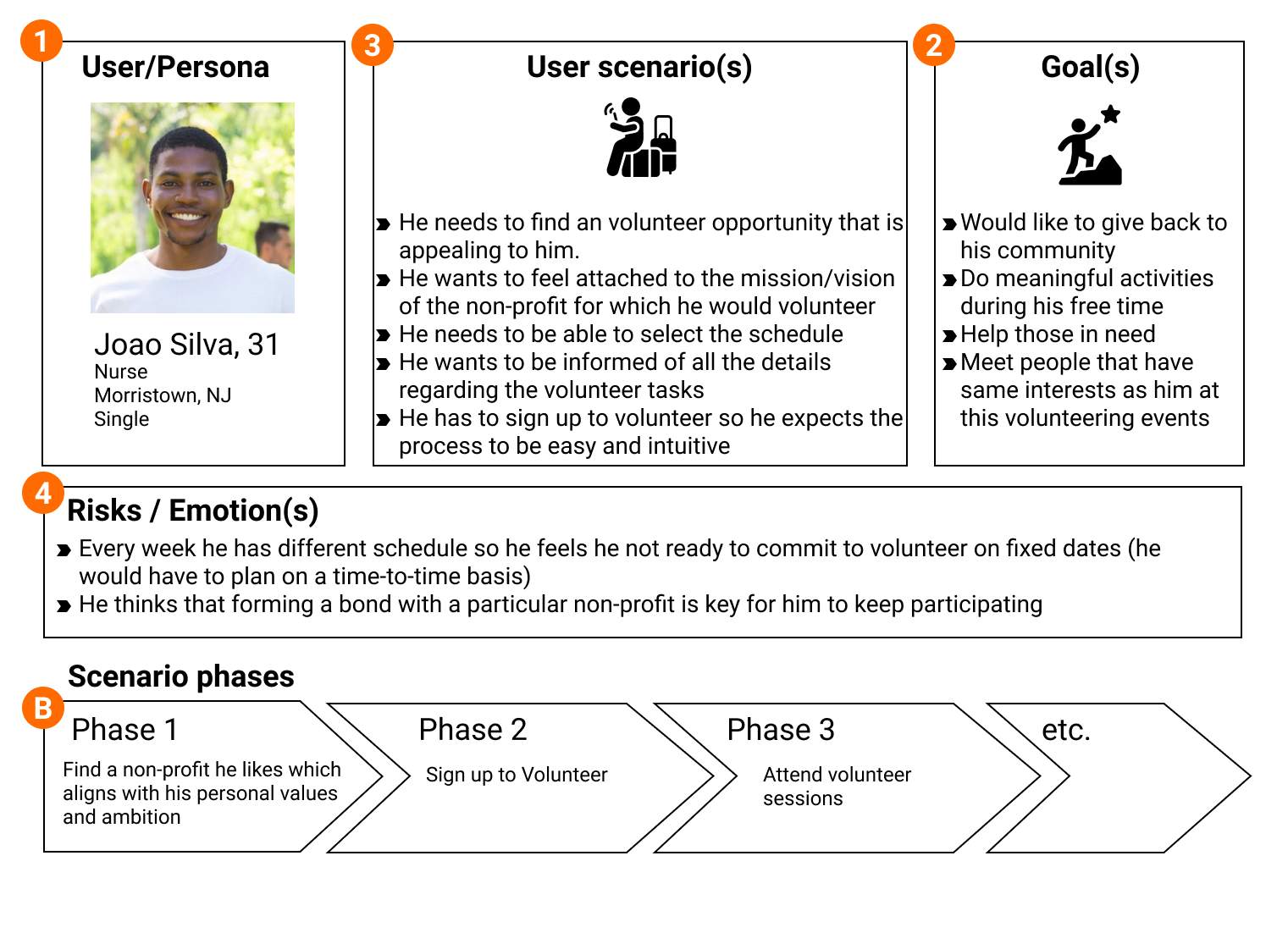
User Persona
We created a User Persona based on the user interviews and research helped pinpoint the general member for this organization as well as portray needs and frustrations we aimed to resolve
Meet Joao Silva, he has a passion for giving back to his community but has a busy schedule due to his long shifts He would like to volunteer at least once per year but finding volunteering opportunities that are easy to sign up and align with his values has been harder than he thought.
What I would do differently
Though this User Persona was created based on the data found from interviewing and surveying, I question if it is enough to pinpoint the exact changes needed to improve engagement and user-friendliness of the existing website. Should we have created multiple user personas? Does Morristown Habitat for Humanity volunteers live near the site or do are people willing to travel to Morristown to volunteer? Is there an age limit to volunteer as they deal with heavy equipment and machinery to build homes? If I were to re-do this, I would ask more questions in the research phase to create a more in-depth user persona and possibly create variations of different types of members as Joao may just be one example.
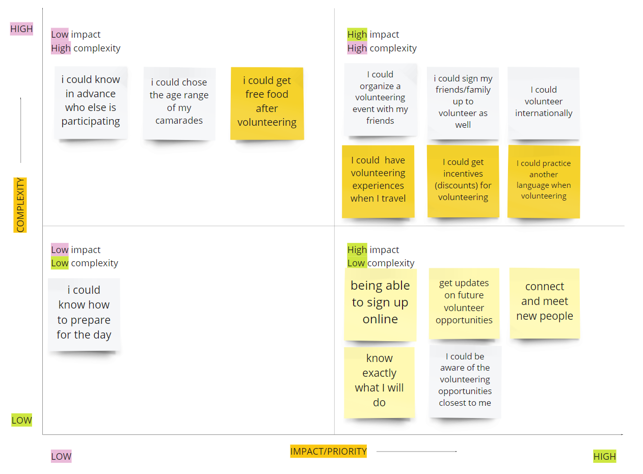
Feature Prioritization Matrix
We focused on the high impact, low complexity matrix to assist us in prioritizing which elements of the website to focus on based on our user insights and research
What I would do differently
I question if there are other methods to use to best decide which features to prioritize when redesigning a product or website. Are there any downsides to the high impact, low complexity matrix such as users who are bothered by receiving updates and having their inbox flooded? Would users find the addition of connecting and meeting new people as an invasion of privacy?
Storyboard
I then created a storyboard based on findings from the research phase to present Joao’s journey of wanting to find a meaningful organization to volunteer with while accommodating his schedule, beliefs, and needs.
What I would do differently
I love creating storyboards as it does wonders to take user frustrations, convey a story of a meaningful user experience, and effectively present them to stakeholders and allow me to stay on track with the design process tailoring to users’ needs. If we were to conduct more research, I would re-do this storyboard to showcase other ways users can have a positive experience with Morris Habitat for Humanity

Competitive Analysis
I conducted an analysis for direct and indirect competitors to see other non-profit organizations and how we can improve the functionality and experience of the website. With this analysis, I was able to review opportunities and considerations to assist with the design process
What I would do differently
At the time, I was happy with the layout and presentation highlighting categories to compare Morristown Habitat for Humanity to similar organizations. However, I do not think this was detailed enough to present to stakeholders. I believe it would serve a better purpose to write descriptions of each category and showcase the strengths and weaknesses of each organization to see exactly where we could improve and have an advantage over other competitors. Since this was a specific branch of Habitat for Humanity, If I were to re-do this, I would also include a comparison between Morristown and another branch to see how we are performing compared to other networks.

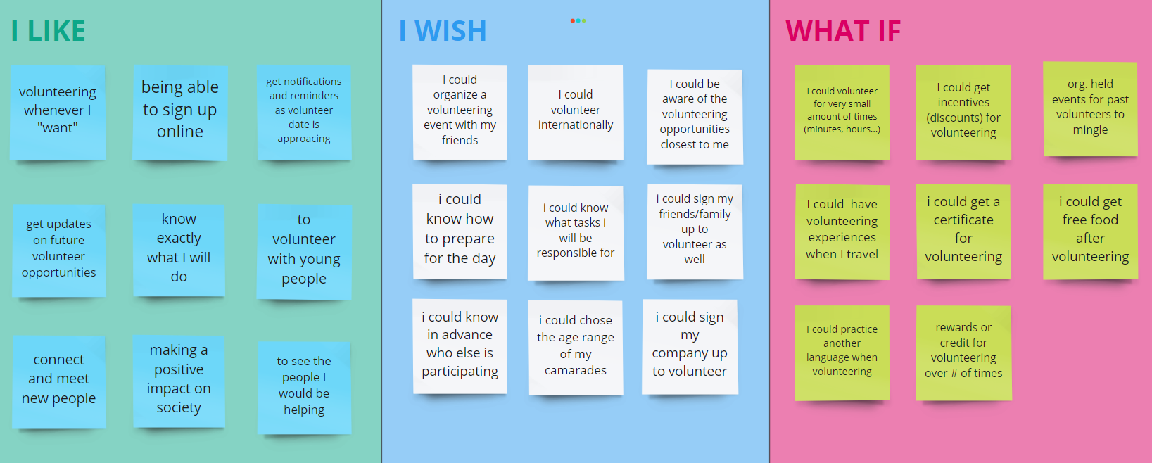
I Like, I Wish, What If Design Method
This method was a great way to organize feedback obtained from user testing. From this process, we learned that:
Members would like to know what tasks they are responsible for
Volunteers wish to learn how to prepare for the day
They want the ability to sign up their friends and family members
I would like to learn if other methods are encouraged such as using “I Wonder” or “How Might I” to receive more constructive feedback to assist with the design process
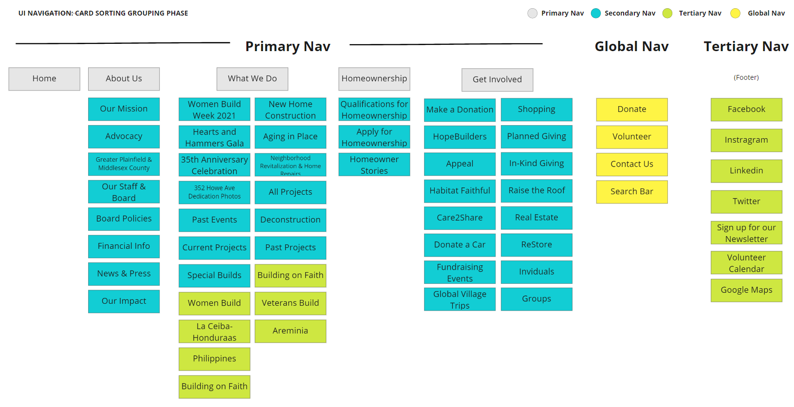
Card Sorting: Define and Grouping Phase
A pinpoint discovered during the research phase was the overwhelming navigation bar that made it difficult for users to find what they were looking for. Our first step was to list out the existing navigation bar using the card sorting method. This visualization method helped us clearly see what tabs are in the existing site to figure out what we could consolidate or remove if the page was outdated.

After listing it out, we then grouped the navigation bar to get a visual
Final Card Sorting and Sitemap
From the initial card sorting, we conducted more tests to improve the overwhelming information architecture and functionality to ensure users could find the sources they were looking for.
What I would do differently
Due to the time constraint, I believe this new navigation bar layout would benefit from more user testing by asking users what tab they would go into to find a specific source. This process was challenging as pages such as "Habitat Faithful” that users found irrelevant, stakeholders found it rather important. I would like to learn more about the best practices to tailoring to both user and stakeholder needs to make improvements.
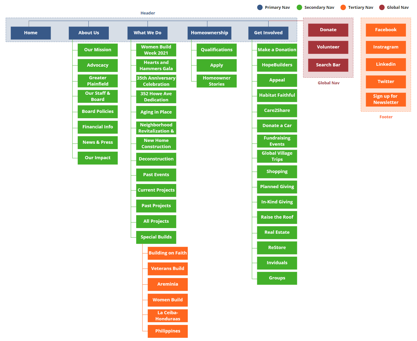
Navigation Bar Design and Testing Process

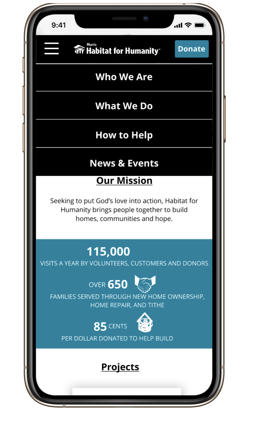
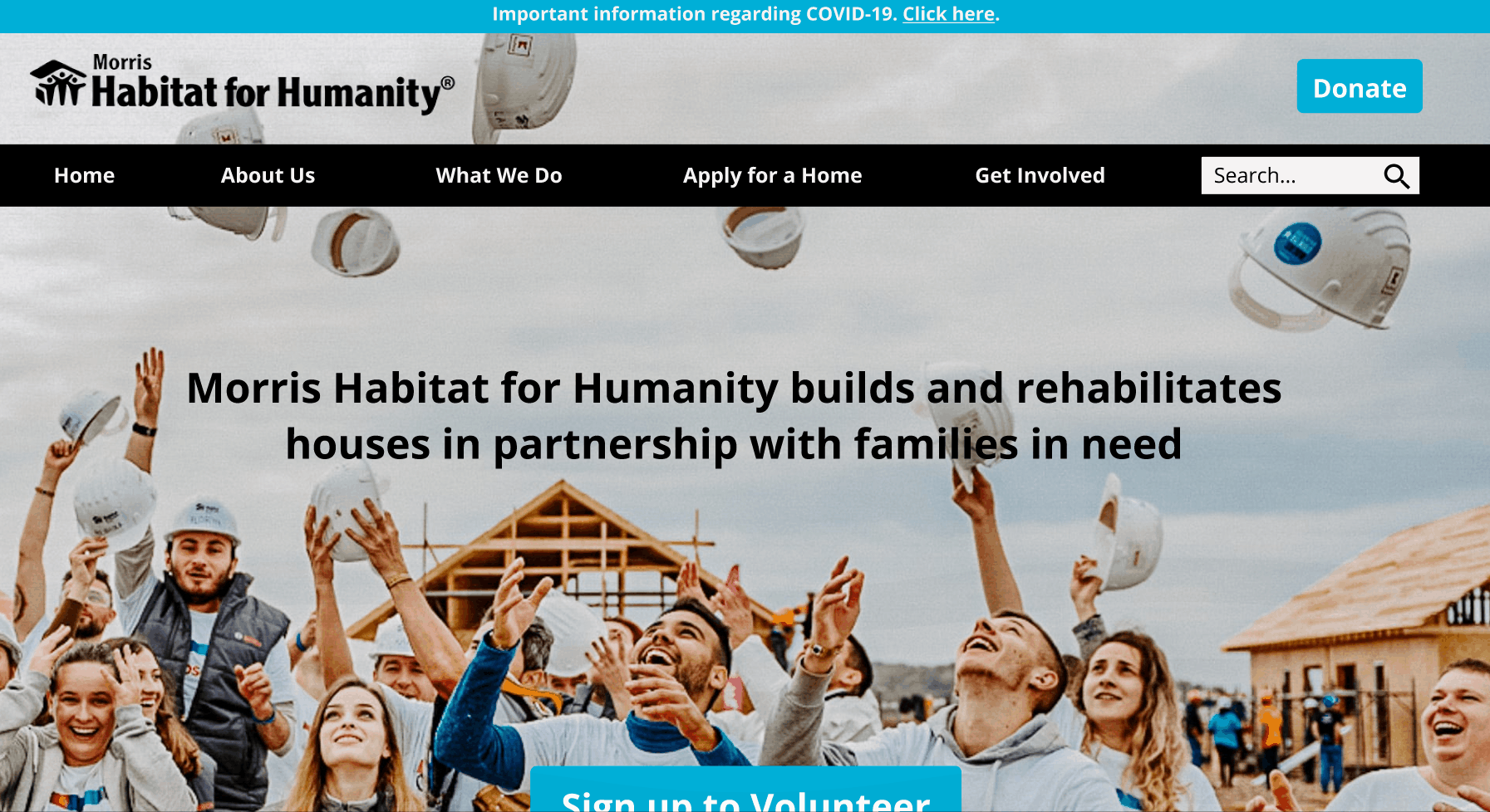
Before and After Comparison
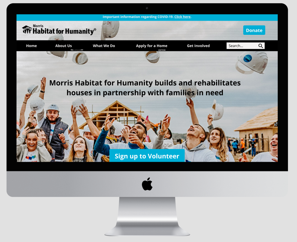
In the existing website, we can see that the mission and vision of the organization is unclear. Users found that the website lacked aesthetics and found the window opening navigation bar confusing. Additionally, the website was not designed for responsiveness, making it difficult to navigate the website using a mobile device. For this reason, we re-designed the desktop version and created a mobile version as well.

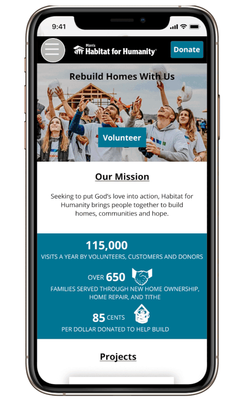
After - Highlights and User backed reasons behind design decisions
In the newly designed Morris Habitat for Humanity website, you can see a number of changes were made to improve the aesthetics and user-friendliness of the website.
We re-designed the navigation bar to make drop-down sources easier to find.
We also placed a big button to “Sign up to Volunteer” to improve CTA.
Users were confused if the organization was still taking volunteers or if it was safe to volunteer in light of COVID. We placed a banner at the top to explain new protocols in place to protect volunteers during the pandemic.
During our user interviews, we also found that members wanted to read about homeowner stories and how they obtained the homes of their dreams thanks to this incredible organization, so we placed a section to highlight this.
In our stakeholder interview, we asked them how they received funding. They explained that “Restore” is Morris Habitat for Humanity’s sister organization that sells thrift furniture and the profits are used to fund this organization. We were astonished as Restore was hidden inside the secondary navigation. For this reason, we highlighted Restore on the homepage to encourage members to purchase thrifted items to help fund the organization. Members can also sign up to volunteer, donate, and shop at Restore as well!
Final Thoughts
This was the first project I worked on that contributed to making a real-world impact and left me with such a gratifying feeling. The stakeholders were informed of the process through the projects and were sent the mockups if they’d like to implement these designs. It was an exhilarating experience working on this two-week project which was eye-opening as it shows just how much a team can get done in a short amount of time!
Next Steps (2.0)
We would like to do more usability tests on each segment of the site to improve the information architecture, visual presence, and resolve user pain points discovered during our interviews
Our next step will be ensuring that users are able to sign up to volunteer seamlessly
We are continuing to work with our non-profit organization to improve their online presence and attract more volunteers and donations
Tools


Design Process


